I never in a million years thought I would be a play space in the living room kind of parent, but here we are... and you know what? It works for us. Well it was working for us. After a few months with this setup, it became clear that our little galley play space needed to be re-thought. And last weekend I finally got around to it...
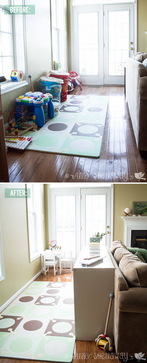
Before the redesign we had everything lined up against the wall, and Emma would inevitably get bored and start digging all of her toys out of the bottom of those mesh bins. It made for very unfocused and messy play. We also had a lot of toys from when she was younger that we needed to weed out.
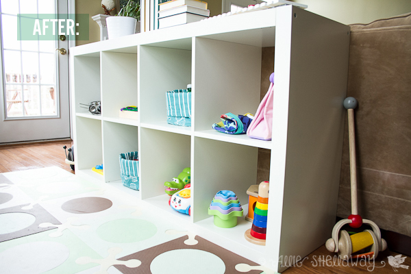
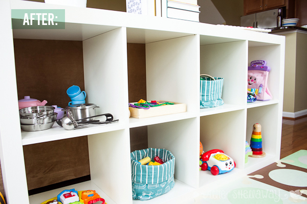
Now Emma's toys are all within view, and mostly organized by type of activity. I know what you're thinking - there's no way it still looks like this. Well, I'm happy to report that it does! It's surprisingly much easier to clean up than before. Maybe because everything has its own place and the shelves aren't overflowing with toys.

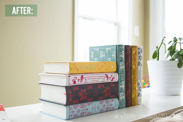
What I love most about our shared living/play space is that you can't really see it when you first walk into the living room. And I finally found a place to display my beloved Penguin Classics collection of books...
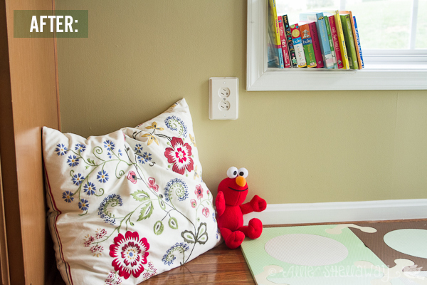
I still have a couple of To Dos for the space, including some art in between the windows and a little upholstered chair to replace this pillow in Emma's reading nook:
What are your thoughts on having a play space in the living room? Major faux pas or an inevitable fact of life with kids?
(PS... try to ignore all the beige-overload. Oh how I can't wait to be a homeowner again.) :)
Resources:
