Happy Teacher Appreciation Week + a free printable

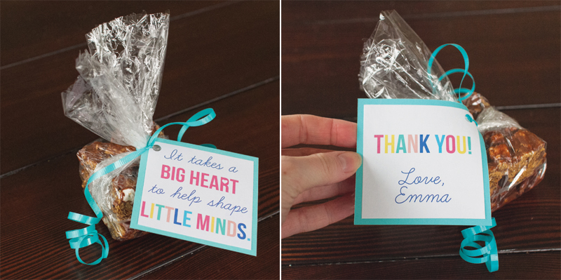
teacherappreciationtag1x1 Happy Teacher Appreciation Week! I whipped up these gift tags last night for Emma's teacher's gifts and thought I'd share. You can download a 3x3 of the above front and back tags HERE.

Here's what ours ended up looking like:

teacherappreciationtag1x1

(Yep, those would be Golden Grahams S'Mores bars. Super easy to make and even better than regular Rice Krispie Treats.)

Huge thanks to all the teachers out there who do an immensely important job for a fraction of what you deserve to get paid. Your students may not always appreciate you, but please know that us parents are forever grateful for what you're doing for our kids. So thanks!!! :)

a better place to play

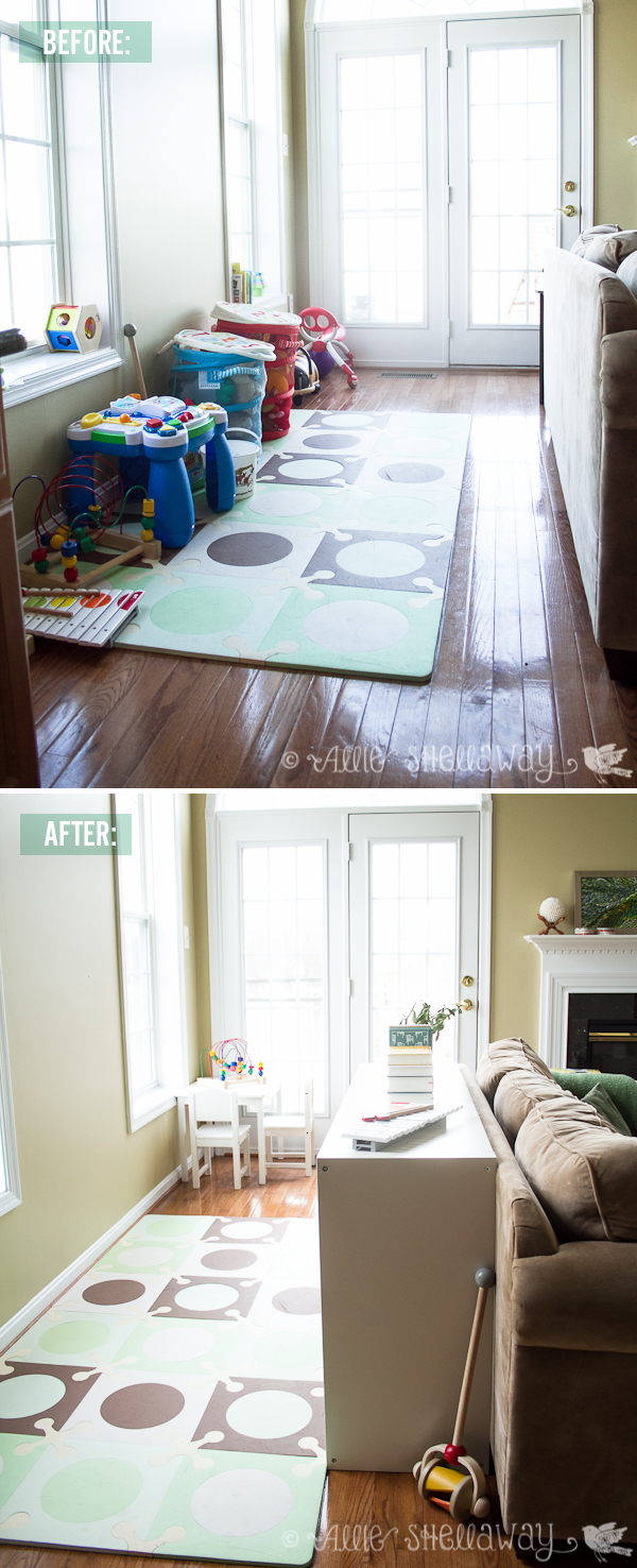
I never in a million years thought I would be a play space in the living room kind of parent, but here we are... and you know what? It works for us. Well it was working for us. After a few months with this setup, it became clear that our little galley play space needed to be re-thought. And last weekend I finally got around to it...

Before the redesign we had everything lined up against the wall, and Emma would inevitably get bored and start digging all of her toys out of the bottom of those mesh bins. It made for very unfocused and messy play. We also had a lot of toys from when she was younger that we needed to weed out.

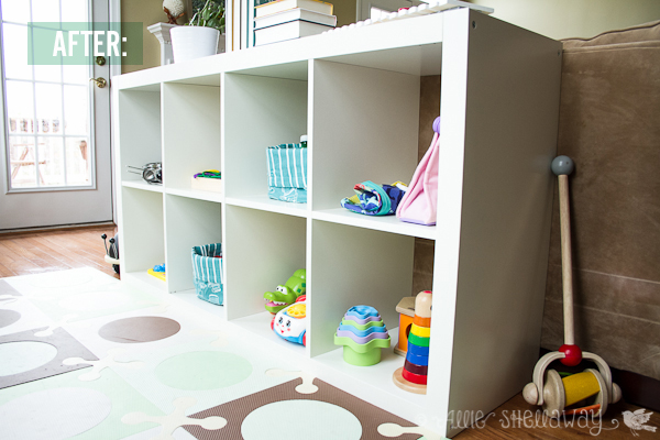
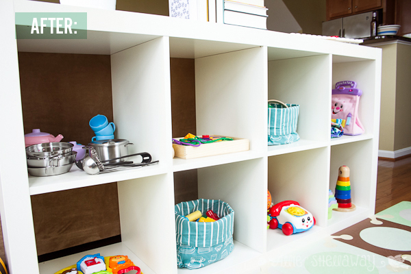
Now Emma's toys are all within view, and mostly organized by type of activity. I know what you're thinking - there's no way it still looks like this. Well, I'm happy to report that it does! It's surprisingly much easier to clean up than before. Maybe because everything has its own place and the shelves aren't overflowing with toys.

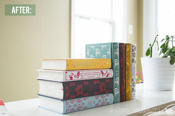
What I love most about our shared living/play space is that you can't really see it when you first walk into the living room. And I finally found a place to display my beloved Penguin Classics collection of books...

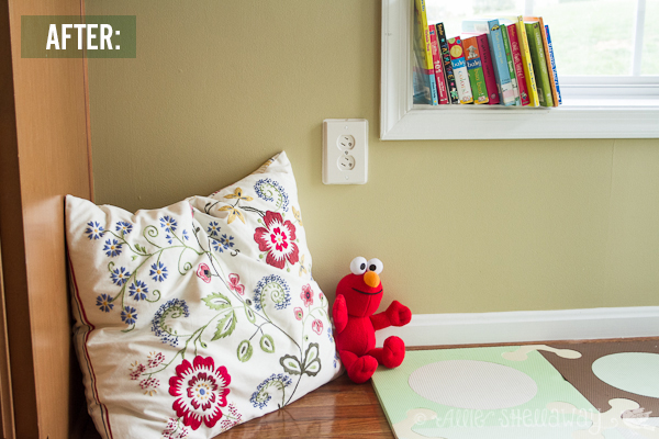
I still have a couple of To Dos for the space, including some art in between the windows and a little upholstered chair to replace this pillow in Emma's reading nook:

What are your thoughts on having a play space in the living room? Major faux pas or an inevitable fact of life with kids?

(PS... try to ignore all the beige-overload. Oh how I can't wait to be a homeowner again.) :)

Resources:


Lil' Red

Happy Halloween! Well, first I hope everyone is safe, sound, with power, cell service, etc. Second, Happy Halloween! I'm so glad the kids around here will still get to go trick or treating tonight. Emma's still a little young for that, but I made her a costume anyway because we all know I just couldn't help myself.

I used Simplicity 1774, red fleece for the cape, and blue gingham for the dress. The pattern could not have been easier, especially with fleece because that meant I didn't have to line the cape. I did add some topstitching to give it a more finished look. And I used buttons to fasten the shoulder straps instead of hook and loop tape. Mostly because I forgot to buy hook and loop tape.

We were late getting out the door this morning, so this was the best I could get. (Note to self, learn how to use my Speedlight. That grain is killing me!) What you can't see here are the adorable new white chucks I got her to go with her costume, which of course are her favorite part.

Have a happy, safe, and sugar-filled Halloween, everyone!

Zachary's 1st Birthday!

This past Sunday was my sweet nephew's 1st birthday, and I was so excited to do the decorations for his party. Zachary looooves monkeys so my sister naturally went with a monkey theme. I busted out my Silhouette and got to work...

Our super talented cousin Emily made all the baked goods, and I added the name cards, wrappers, and toppers. I purchased a set of monkey clip art for the graphics and custom Silhouette shapes. I used the leftover dots from cutting the cupcake wrappers as confetti.

I got this super tall palm tree from Party City to display photos from Zach's first year. The bananas are a Silhouette shape and I used the Xyron to make them into stickers.

Happy Birthday, Zachary!!! :-)

PS... I'm trying out some new photo layouts from Pugly Pixel, and really liking them. The best part is they're FREE! Gotta love the Internet.

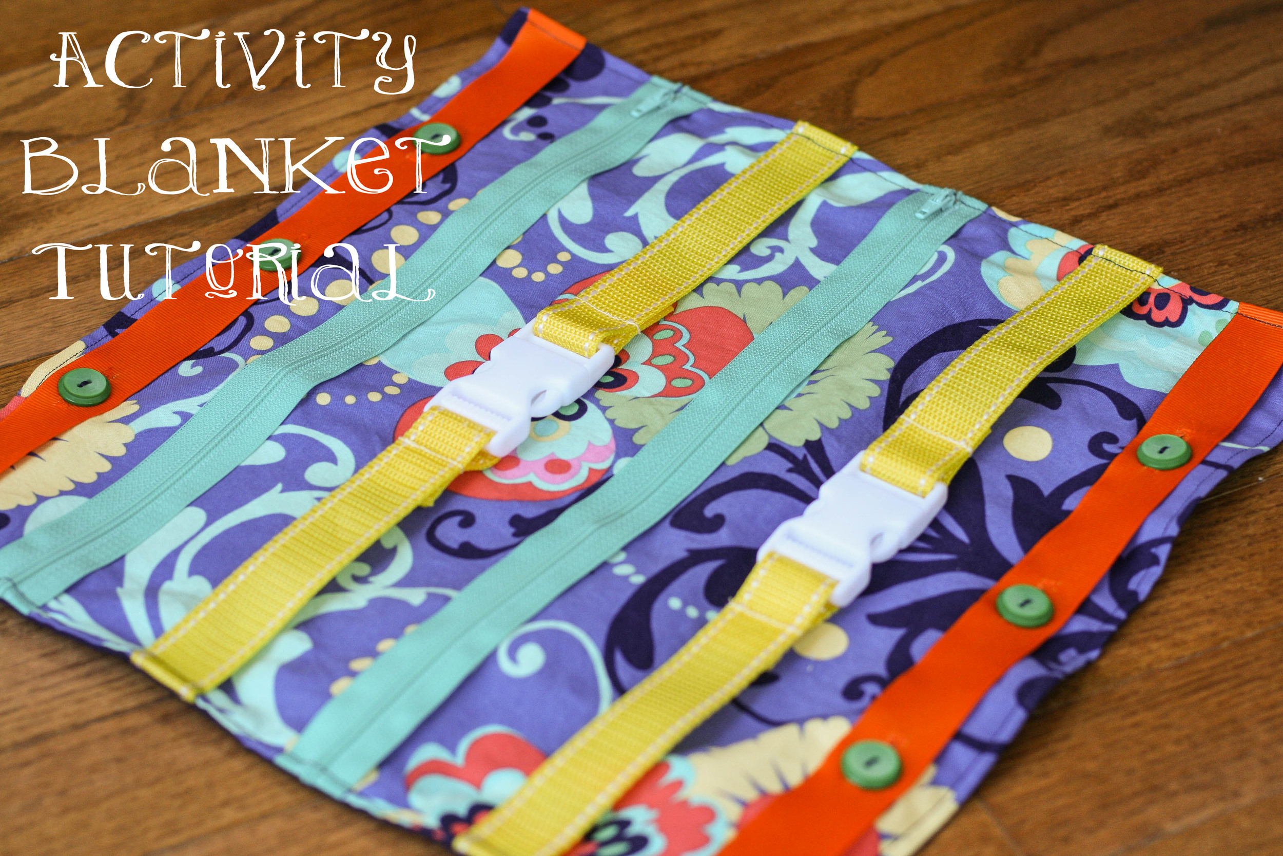
activity blanket tutorial

activity-blanket-tutorial.jpg

Emma has been obsessed with clips and zippers lately, so I thought I'd make her a little activity blanket so she could clip and unzip to her heart's content. (I can't even tell you how good it felt to bust out my sewing machine for the first time in months.) And, it was so simple to make that I actually made it during naptime on Sunday afternoon. Plus I used scrap fabric, and I love any project that puts even a little dent in my stash.

If you're just learning how to sew, this is a great beginner project because aside from the button holes it's just a bunch of straight stitches. And there's no need to be intimidated by button holes... most newer machines do all the work for you!

Here's what you'll need to make your own:

Materials:

  • Two 15.5 x 15.5 in. squares of fabric
  • Two 15.5 in. pieces of grosgrain (or similar thick ribbon)
  • Four 6 in. pieces of nylon webbing (or similar thick webbing, ribbon, straps, etc.)
  • Two 14 in. zippers
  • Two plastic buckles/clips
  • Buttons (at least 6)
  • Lighter (yes, you read that right!)
  • Coordinating thread

Directions:

Create your clip "activities" by sewing your 6 in. pieces of nylon webbing to each end of the buckle. Now here's the fun part - use a lighter to seal the cut ends of the webbing. Yes, it's a little sad that the most badass my life gets these days is taking a lighter to some frayed edges, but I take what I can get. :) Besides, it really is the best and quickest way to make sure your ends don't fray.

Next, lay out your "activities" on your front fabric to get the spacing right. I just eyeballed mine, leaving about an inch and a half between activities.

Pin only the zippers in place and remove the rest of the activities.

Sew your zippers into place.

Set the blanket aside for now and grab the ribbon for your button activities. Mark the spots for your button holes at 4", 7.5", and 11".

Sew your button holes. I used 1" buttons for this, and wouldn't go any smaller. (Note, if you use grosgrain and have some fraying when you open your button holes, use your trusty lighter to carefully seal the edges.)

Next, lay your activities out on the front fabric again, pin and baste into place.

Then, grab your back fabric and pin it to the front fabric, right sides together. Sew together using a 1/2" seam, leaving a 4-5" opening at the bottom.

Press your seams open, then turn the blanket right side out and sew a 1/4" topstitch around the perimeter.

Last but not least, sew on your buttons. I chose to sew mine on at the very end because I'm paranoid about Emma being able to get them off, creating a potential choking hazard. I figured two layers of fabric would be a sturdier hold.

And once all the buttons attached, you're done!

Emma is loving it so far, and I'm excited to see how her interest in it changes as she becomes better at manipulating each activity.

Let me know if you make one, and leave a comment if you have any questions!

Our First House: Before & After

(Note: most of the before photos are from the original listing when we bought the house, and all of the after photos are what our photographer, Terry Iverson, took right before we went on the market.)
Front Before
Front After

{Changes made}

Nothing major... just landscaping maintenance and getting the trees trimmed back

Living Room After

{Changes made}

Nothing major... ahead of going on the market we took down our massive TV and decluttered the bookcases and mantle

Dining Room After

{Changes made}

- Painted the same color as the living room to make it feel more like one big space

- New curtains and hardware

- Ahead of going on the market we gave the main section of the buffet a new coat of paint so it would shine at the showings

Kitchen before
Kitchen after

{Changes made}

We upgraded all of the appliances except the dishwasher. You can't see it in this photo, but we also upgraded the refrigerator from a white side by side to a stainless steel with french doors with a pull out freezer drawer. It was roomy and wonderful.

We also replaced all of the cabinet hardware, which made a much bigger difference than I anticipated considering it only cost us about $100.

Landing Before
Landing After

 {Changes made}

Got rid of that hideous yellow and painted the whole area a nice neutral color

Sun Room before
Sun Room after

{Changes made}

This is one of the most changed rooms in the whole house, and you can get all the details here!

Guest Bedroom before
Guest Bedroom after

{Changes made}

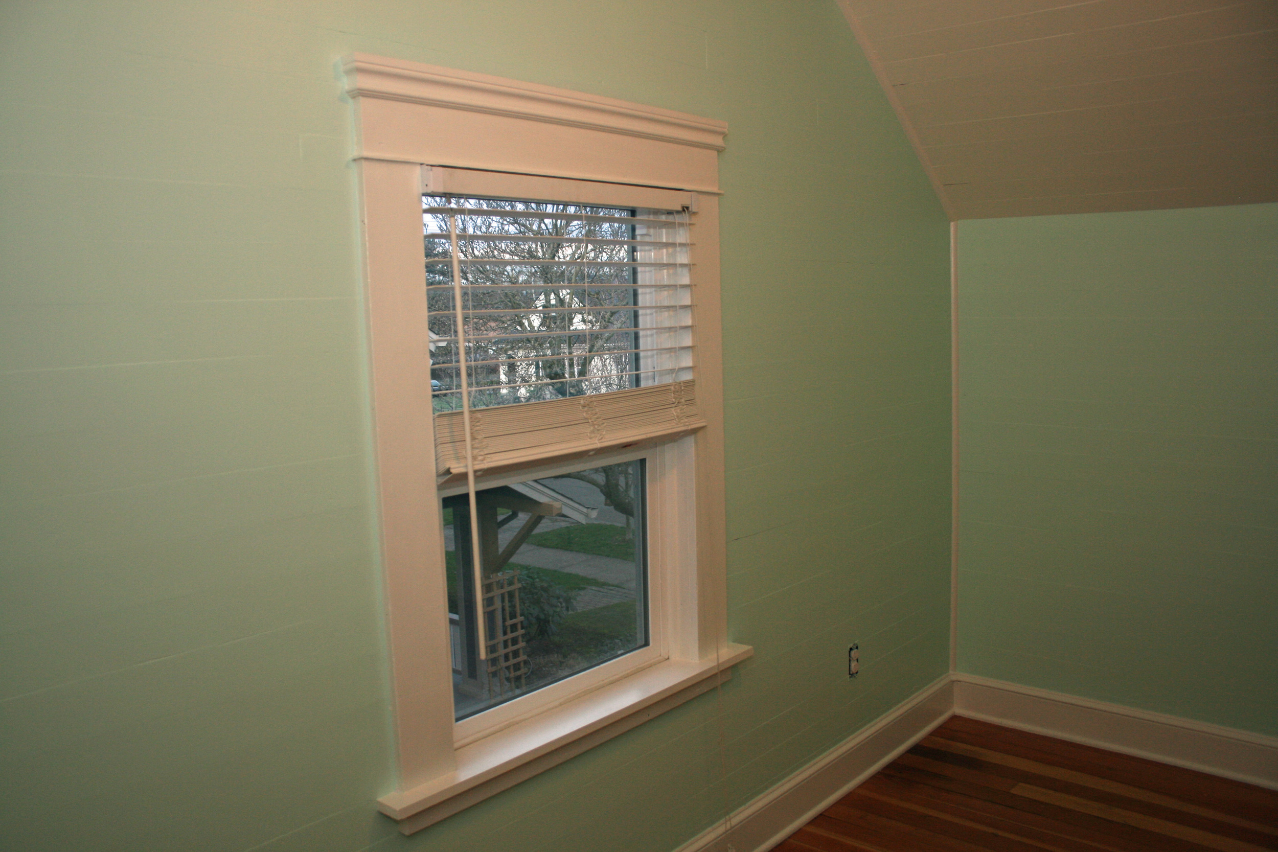
It's amazing what a coat of paint will do! We got rid of that icky dark blue and painted the room one of my favorite colors ever, Benjamin Moore Woodland White. It's this super soft pale green and I love how it completely transformed the room.

We also replaced the outdated window treatments with simple roman blinds.

Guest Bathroom before
Guest Bathroom after

{Changes made}

You can't see it in either picture but we replaced the gross crooked builder grade round bulb light fixture with something much prettier (and level!)

We also gave the wainscoting another coat because whoever originally renovated this bathroom only gave it one coat and you could see the bare wood peeking through. Shame shame.

Nursery before
Nursery after

{Changes made}

This room still makes me so happy. :-) You can read about all the changes we made here.

Master Bathroom before
Master Bathroom after

 {Changes made}

Ah yes, the saddest master bathroom of all time. It's so tiny! It's definitely the thing I miss least about our first house. We were pretty limited in what we could do here, but we did give it a lighter paint color (Benjamin Moore Pearl River).

We also took the shelves out of that nook to the right of the shower and installed towel hooks and a basket, that way we could keep the walls clear and make it feel just the tiniest bit bigger.

Master Bedroom before
Master Bedroom after

{Changes made}

Let's be honest here, one look at the bedroom before and it's not hard to believe that the owners before us got divorced. From the paint, to the ceiling fan, to the TV where the vanity should be, it was all just plain bad.

The first thing we did was paint the walls the same Benjamin Moore Pearl River gray that's in the bathroom. We also gave the whole wall with the closets and vanity a fresh coat of white paint. The top to the vanity was bare wood before and it really came together once we painted it white.

We also replaced the old wooden ceiling fan (it had a plastic unicorn head at the end of it's pull string, I kid you not), the window treatments, and installed sconces on either side of the bed.

Basement before
Basement before
Basement after
Basement after

 {Changes made}

The basement was a huge labor of love, and I'm glad for it because by the time we moved we were spending the majority of our evenings down there.

We immediately replaced the Costco washer and dryer with my dream front loading washer and dryer. They almost made doing laundry fun.

We also tore out all of the remnants of old walls that used to be down there as well as the ceiling tiles. (I love how hours and hours of work end up getting packed into one small sentence.)

We installed carpet tiles when I was 8 months pregnant, and turned the space into a multi-use family room, with tv, crafting, and play areas. Jared even had a keezer (it's like a kegerator) down there! It wasn't fancy, but functionally the space really worked for us.

Backyard before
Backyard before
Backyard after
Backyard after

{Changes made}

The backyard was Jared's pet project for the 2+ years we lived there. He worked his tail off weekend after weekend, and it shows. He ended up creating so much more space for us back there, including areas for grilling, a garden box, and a fire pit. We moved before the weather got nice, and I would have loved to see it one more time in full bloom.

Whew! That's it! 2 years of hard work packed into one post. If you have questions about resources or anything else, just shoot me a comment or email.

in defense of crafty moms

If you're a mom on Facebook, you very likely saw this blog post going around last week. And while I agree with some of what the author had to say, it also made me feel a little defensive. Mostly because Pinterest is my happy place, and it threw me for a loop that it caused anyone to feel pressured and discouraged. You mean not everyone logs into Pinterest and gets lost for hours in seemingly endless inspiration?? I guess the difference between me and the author is that I craft because it's who I am... I was a maker long before I was a mama. Second only to my family, crafting is my raison d'etre. So while yes my child wants ME and I want her, I can't just be "mama." Being a maker is what nurtures me. And if I don't make time for that, then I'd feel like I lost part of my identity. So as much as the author doesn't want to be made to feel bad for struggling to do a fancy braid in her daughters' hair, I don't want to be made to feel bad for sewing my daughter a Christmas dress or looking forward to her birthday as an excuse to give my Silhouette a workout. I don't do any of this to make other moms feel inadequate, nor do I feel peer pressure to go overboard at pretty much every crafting opportunity - I do it because I simply can't help myself.

So anyway, back to Pinterest... fellow moms, I beg you, please don't turn my happy place into the latest thing that's wrong with modern motherhood. One of the things I've always loved most about the design/DIY/sewing community online is how insanely supportive and encouraging everyone is toward one another, and until that article, I thought Pinterest worked the same way. Yes, there are things about it I could do without. I avoid the Popular page like the plague because it's the Internet equivalent of Top 40 radio... it exists only to remind me how little I have in common with the masses. And I scan past people's fitness pins like salads on a restaurant menu - we all know that's not why I'm here... give me a pulled pork sandwich and let me be on my way. But, that's the beauty of Pinterest - it can be whatever you want it to be. If you like the recipes but the crafts make you feel like a lazy mama, just unfollow your friends' crafting boards. Why set yourself up to feel bad? That's just silly.

Trust me, I have plenty of imperfections that Emma will likely remind me of daily when she's a teenager, so for now - let me have my homemade ice cream and personalized quilts. Those are the things I'm good at. Do I think they make me a good mother? Of course not. But on those days when Emma has eaten nothing but Os and raisins, only managed 2 twenty minute naps, and is in her 3rd outfit of the day, I can lay her down to sleep for the night in a room filled with stuff that I made her and feel just a little better about myself.

{craft fail} natural egg dyes

photo-2-1.jpg

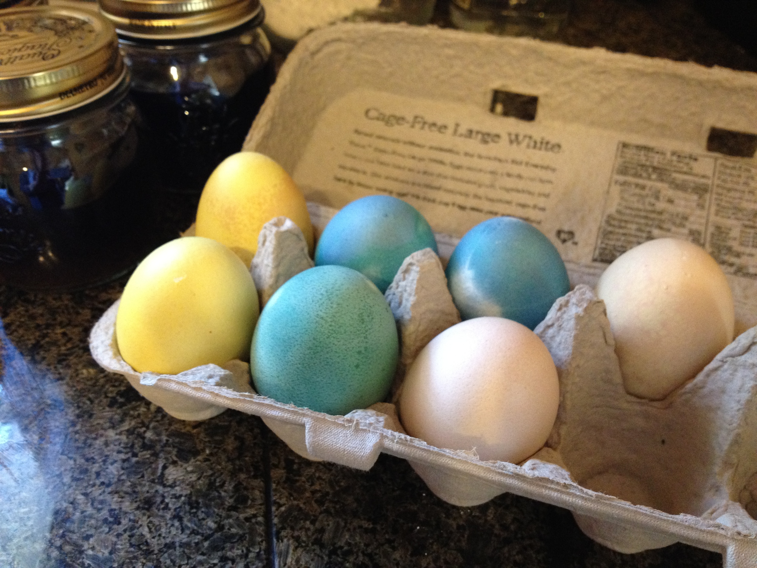
I try hard to be a green mama, but sometimes it ends up being more trouble than it's worth. I mentioned on Friday how we were planning to dye our Easter eggs using natural dyes. It was great in theory, and I was looking forward to seeing the effect of the different ingredients. I picked up a variety of veggies from Whole Foods, and even bought these cute little canning jars from Sur la Table. I followed the instructions on this site to make the following dyes:

  • Yellow (tumeric)
  • Blue (red cabbage)
  • Pink (beets)
  • Green (red cabbage and tumeric)

See, look how cute they are in their little jars. I felt like Super Eco Mom. I let them sit in their dyes overnight, and when I took them out in the morning...

Wah waaaaahhh. I'm grateful Emma's too young to remember her first Easter eggs, because no kid would get excited about these. They're the Easter equivalent of handing out raisins at Halloween. I've seen photos of other people's naturally dyed eggs, and they look great - so I have no idea why mine were such a bust. But they really really were. Looks like we'll be trying Kool-Aid to dye them next year!

PS... It wasn't actually a total bust. I used the leftover beets to make a puree for Emma which she liked but was a complete and utter mess, and the leftover cabbage to make a crazy delicious coleslaw. I used this recipe (minus the celery), and highly recommend it if you like vinegar based coleslaws (which are far superior to mayonnaise slaws, IMO.)

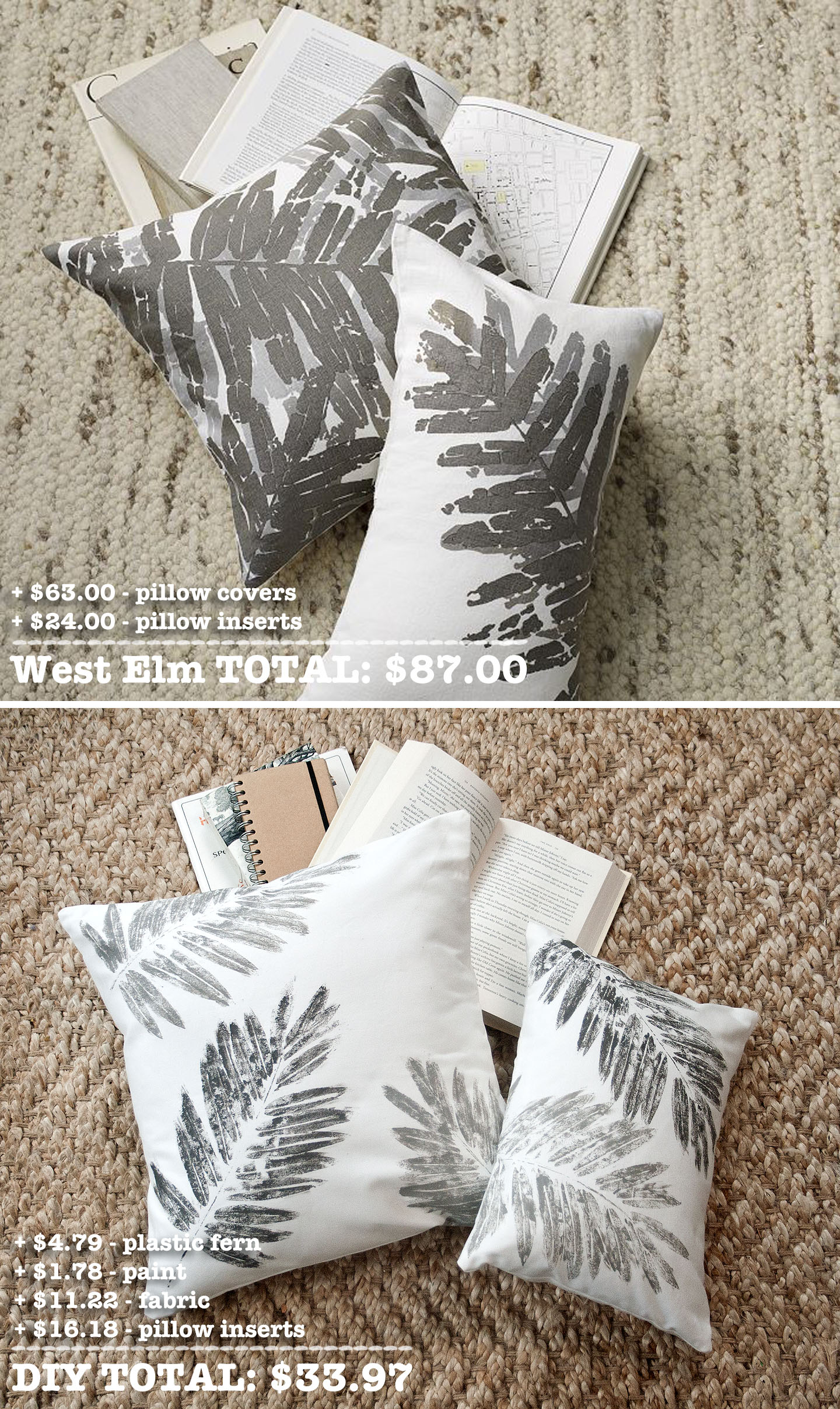
{craft the catalog} West Elm Shadow Fossil Leaf Pillow Covers

I immediately fell in love with these pillows when I saw them in the West Elm catalog. They seemed so unique and I love the go-with-anything grays. But I have a hard time spending a lot of money on throw pillows, so I got to wondering if I could DIY something similar using a fake fern as a stencil. The result? Well, see for yourself...

I love them! And I hope you do, too. Plus, hello... less than half the cost! Here's what you'll need to recreate the look.

Supplies:

  • 1 1/2 yds fabric (heavy weight cotton)
  • 2 shades of gray paint (I used Folk Art Steel Gray and Medium Gray)
  • 2 fake ferns (I got mine in a bunch from Michaels)
  • 18x18 pillow insert
  • 12x16 pillow insert

Start by cutting your fabric... you'll need:

  • 1 piece that's 18.5x18.5
  • 2 pieces that are 18.5x12.25
  • 1 piece that's 12.5x16.5
  • 2 pieces that are 12.5x11.25
Then lay out some trash bags to protect whatever you're working on, and paint your first fern the lighter shade of gray. You can use whatever you want to paint the fern... I found a foam brush worked pretty well. Try to get good coverage with your paint, and make sure to get the stem.

Then stamp the 18.5x18.5 and 12.5x16.5 pieces of fabric. Press firmly, but don't worry about any imperfections. This isn't supposed to look perfect.

Wait a few minutes (not several, just a few... if the paint dries on the fern it will peel off when you go to re-stamp) and re-stamp over what you just did with the same paint color. I found that double stamping made it look much better. Again, try to line it up but it doesn't have to be perfect. Then repeat with your darker paint color. The West Elm pillows have the darker gray layered over the lighter gray, but I tried that and it just looked like I screwed up. So this was my alternative.

Let the fabric dry overnight, then heatset with a dry iron. Use your other fabric pieces to sew a basic envelope pillow. I won't bore you with a tutorial since there are already several good ones online. I particularly like this one.

Here's how they look in their final resting place... our bedroom!

Let me know if you have any questions about the tutorial! I hope you guys are liking these DIYs. I have one more planned out for now and am looking for more, so let me know if you see anything you think is ripe for knocking off. :-)

roll with the changes

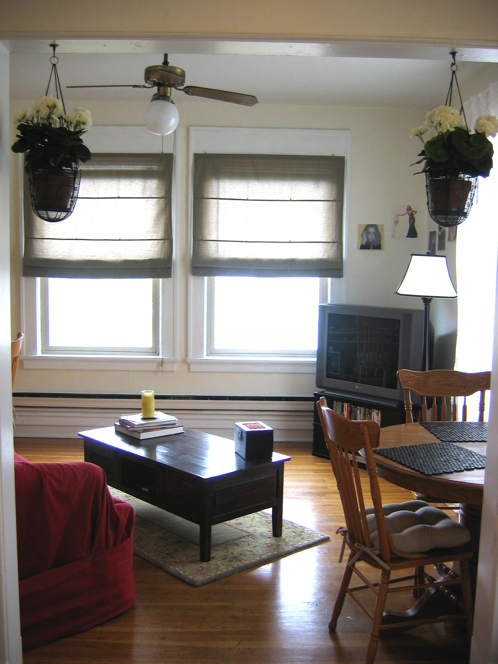
When Emma became mobile a couple of months ago we knew we'd have to make some changes to our living room to give her more space to play. My goal was to be able to go from living room to play room and back again in less than 2 minutes. I knew if it took any more time or effort that our living room would become a permanent playroom and five years from now we'd be one of those desperate couples on Dear Genevieve who used to have semi-decent taste but whose house has become overrun with toys and laundry and kitchy sayings over the door like "a meal without wine... is breakfast!" Oh no. We will not be one of those couples. So, our first step was to buy a bigger rug... we opted for something relatively disposable since babies are not tidy creatures, nor is our 65 lb dog. The Havbro does the job, but I won't be sad to see it go. So now Emma had a nice big rug to play on, but we still had the issue of the coffee table. Then it hit me... what if we sawed off the legs and replaced them with casters so we could easily roll the table out of the way during play time?? I've certainly had crazier ideas, and Jared was on board so we used a circular saw to cut off the legs, and replaced them with the steel casters we ordered off of Amazon. And, voila!

And here's what it looks like during playtime...

Here's a close up of the casters...

It's working out surprisingly well for us, so far. And I actually kind of like the industrial feel the table now has. The only downside is that the casters don't lock, which is a bit concerning for her tiny fingers, and for when she gets strong enough to move the table on her own. So for now we're super careful not to let her play with the wheels (it's not like we leave her unattended anyway, so it's really not an issue). We didn't want to spend a lot on pricey casters in case the experiment was a bust, but now that we know it works we'd be willing to upgrade the casters if it becomes necessary.

If you're wondering what the coffee table looked like before, here's a shot of it in my first "big girl" apartment in Seattle... It's been through three moves since then. Hence all the scratches. :-)

So where do we hide all those toys when play time is over? They all have their own little basket that fits perfectly into the console table. And they're kept at kid height so eventually Emma can help clean up. (And she'll be able to more easily take each and every toy out of there when she decides the one at the very bottom is the one she wants to play with. But I'm choosing not to focus on that part.)

I'm certain these aren't the last of the living room changes... as Emma grows and becomes even more mobile, we'll need to do more baby proofing and likely more decluttering. But for now, operation rolling coffee table has been a great success.

{craft the catalog} West Elm glass terrariums

As I mentioned on Friday, I'm starting a new feature on the blog called Craft the Catalog and I'm so excited to share the first installment! I got the idea for Craft the Catalog while browsing through the latest West Elm catalog before bed one night... I spotted these beautiful terrariums and thought how nice they'd look in our living room. Aaaaand then I looked at the price. $29 for a fish bowl? $69 for a slightly fancier terrarium?? And that doesn't even include the plants (which, let's face it, I'll eventually kill.) I was certain that with a little searching and elbow grease I could recreate the look for a lot less. And (thankfully) I was right...

{Ikea lantern / Petsmart fishbowl / plants and soil from Home Depot}

Not an exact match, but considering how much I saved I'm thrilled with the end result. I don't have a before picture, but they definitely brought some much needed life to the top of our bookshelf...

I already have two more projects planned, so I hope you guys like this new feature. I'm planning to do both home goods and clothing, making only things I'd actually want to buy (I set this rule for myself so that I wouldn't just make things because they were easy to DIY.) Look for the next project in a few weeks!

{nursery progress} paper circle mobile tutorial

paper-circle-mobile7.jpg

Here's the how-to for the paper circle mobile I made for our daughter's nursery... (similar ones sell for upwards of $50 on Etsy, but you can achieve the same look for much much less.)

What you'll need:

  • 2 12" long 1/4" dowels
  • Drill and very narrow drill bit
  • Fishing wire
  • 12 jump rings
  • Needle nose pliers
  • Clear beads (I used CraftDesigner faceted beads in crystal)
  • Pencil
  • Permanent marker
  • Needle or pin
  • 3 shades of the same color cardstock (this is to achieve a gradient effect... you could use all 1 color or multiple colors if you prefer.)
  • 1.5" circle punch
  • Hot glue gun
  • Screw hook

1) Prepare your dowels. Using a pencil, make a mark at 1.5", 3", and 4.5" from each end of the dowel so that you end up with 6 marks on each dowel. Then make a mark a 1/4" from the end of each dowel, and drill a very small hole (big enough for the wire to go through, but not so big that the bead will go through.)

2) Punch out your circles. You'll need 108 circles - 9 circles for each string, 3 of each color on each string.

3) Poke holes in your circles using a needle or pin.

4) Cut your fishing wire. You'll need 12 pieces of wire, approximately 24" long - don't worry about them being exact because you'll cut the ends once you're done putting on the circles and beads.

5) Prepare the jump rings. Using your needle nose pliers, stretch out a jump ring so that it's wide enough to fit onto the dowel. Then tie on a piece of the fishing wire and knot it, trimming the excess of the short end.  Repeat for the other 11 jump rings.

6) Place the jump rings along the marks on the dowels. Use your needle nose pliers to close the jump rings around the dowel.

7) Mark your fishing wire. Once the fishing wire is knotted onto the jump rings, take your permanent marker and make a mark every 2 inches from the knot on the jump ring.  Make 9 marks on each string.

8 ) String your circles and beads. Starting with the darkest shade of your paper circles, string one of your pieces of fishing wire through the pin hole in the paper circle. Then take a clear bead and knot the fishing wire around it at the mark closest to the dowel/jump ring. Repeat for the other 8 circles - circle, bead, circle, bead, etc. - going from your darkest to lightest shades of circles. Cut the excess wire after the last bead.  Repeat for the other 11 pieces of fishing wire.

9) Attach your dowels. Use a hot glue gun to attach the dowels together, crossing one over the other.

10) Hang your mobile. Cut 4 generous lengths of fishing wire, and knot one end of each piece of wire around a clear bead, cutting the excess of the short end. Slip each piece of wire through the holes you drilled at the ends of your dowels, so that the bead stops underneath the dowel preventing the wire from slipping through. Screw your screw hook into the ceiling where you want the mobile to hang (use a drywall screw if needed.) Once you determine how high or low you want your mobile to hang from the ceiling, tie the four pieces of wire into a knot and loop the knot onto the screw hook.

That's it!  Comment or email if you have any questions. There are a lot of variations you could do (like drilling holes and using beads to hang the strings instead of jump rings) so don't feel like you have to stick to the steps exactly.  This is just what worked for me.  Happy mobile-ing!

{nursery progress} DIY song lyric prints

IMG_5669_edited-1.jpg

One of the easiest ways I knew I could save money in the nursery was by making my own art prints.  We knew there were a couple song lyrics we especially wanted to use, so all I had to do was figure out the right fonts and colors.  I used PowerPoint (it's not just for presentations, people!) to design each print, and framed them in Ikea frames.

(Fonts: Eras Light ITC and Marketing Script)

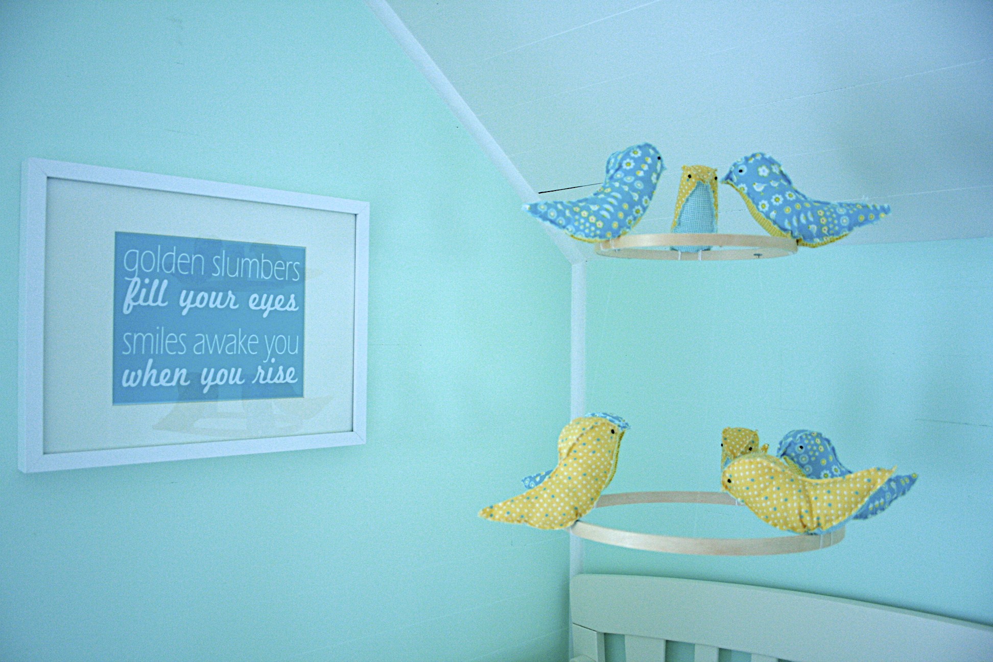
I've always loved the song Golden Slumbers, which is good because it gets stuck in my head every time I'm in the nursery. I can't wait to play it for our daughter.

(Font: Yesterday Again)

Jared and I first heard Murder in the City at Bumbershoot back in 2007 (you can see that exact performance of it right here), and immediately fell in love with it. Shortly after Scott Avett had his baby girl, he changed one of the lyrics to "make sure my daughter knows I loved her, make sure her mother knows the same" - so when we found out we were having a girl, the song became even more special for us.  The lyric in this print is the last line of the song, and we hope that someday those words mean as much to our daughter as they mean to us.

Here are links to download the prints (for personal use only, please):

[dm]6[/dm]

[dm]7[/dm]

Email or comment if you want the PowerPoint files so you can change the fonts and/or colors.

{nursery progress} a tale of two mobiles

IMG_54411.jpg

Yes, you read that correctly... I ended up making not one, but two mobiles for the nursery. If you'll remember, I started out with the idea to DIY a mobile like the one I had in my mood board:

But then my friend, Rachael, sent me the link for this bird mobile tutorial and I decided to make that one instead.  Here's how it turned out:

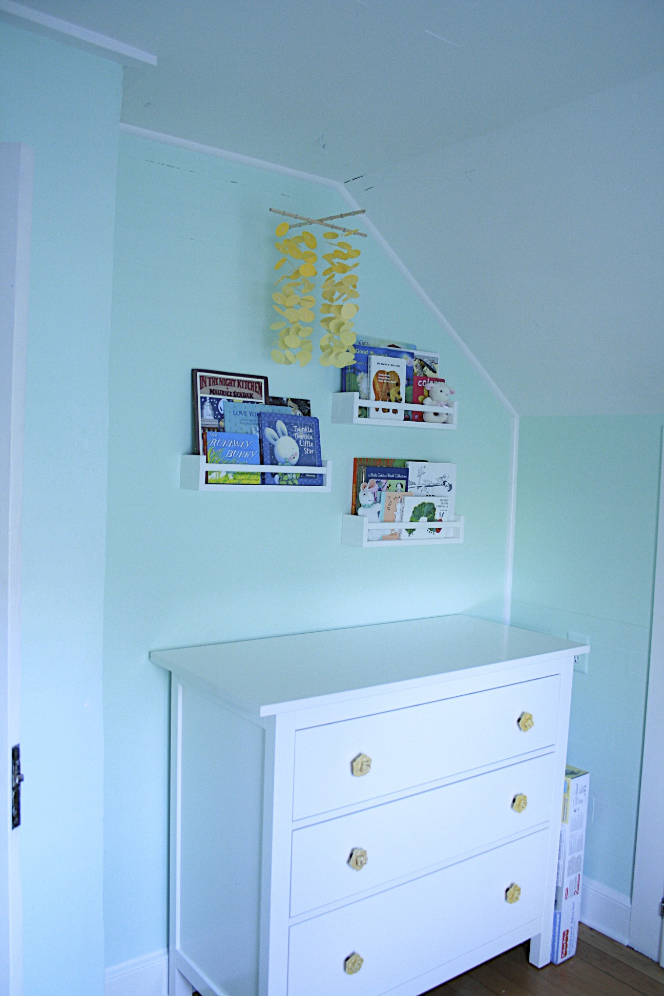
I was so so happy with how it looked, especially once I hung it over the crib - but the idea of that original mobile kept nagging at me.  I love a good challenge, and finding a way to DIY something I saw selling on Etsy for $80 was just my kind of challenge.  So... much to my husband's dismay, I decided to make a second mobile for the nursery.  I had no idea where I'd put this one - if it would replace the bird one, if I'd end up with two mobiles, if I'd junk it altogether after punching out a gazillion little circles.  Luckily, by the time I finished it late one Sunday night, I was completely smitten.  It was so fun and cheery... just looking at it made me smile.  I knew I had to find a home for it in the nursery.  So over the changing table it went...
Here's a close up:

I used 3 shades of yellow paper to get a gradient effect, fishing line, clear beads, wooden dowels, and jump rings.  The whole thing cost me maybe $15.  I'm hoping to get a tutorial posted for it next week so stay tuned!

{nursery progress} paint!

It took us 1 coat of primer, 3 coats of wall paint, and 2 coats of ceiling paint - but the painting is finally done!  As a reminder, here's how it looked before:

And here's how it looks now!

We covered every inch of that room with paint - the walls, the built-ins, the trim, the window, the ceiling, and even that old door.  Before we started I had tested some pretty big patches of a couple different colors on each wall, so I was pretty sure the color we picked would work out - but there's always that moment of panic after you get the first coat on when it's too late to turn back and you're still a couple coats away from being able to see the finished product.  But thankfully it's exactly what I'd envisioned - a rarity in the life of a DIYer.  (PS... the paint is Acro Pure No-VOC from Miller Paint in "Teal Treat" #0712.  The white paint is also No-VOC in a semi-gloss finish... they apparently don't recommend water-based paint for trim because it doesn't spread as well, but we used a soft bristled brush and it worked out great.)

You'll notice that the old door is still there... we realized that a new door would also need a new frame and that was just way more than we were ready to take on.  So we sanded the old door so that it actually closes, and I even managed to fix the mortise lock so we don't have to replace that either.  We're going to leave the glass uncovered for now, but I'll probably add a little curtain for it down the road.

Oh, and here's a close-up of the new hardware on the built-ins:

I'm kind of obsessed.

I can't even tell you how happy I am to have the painting done... not only because it means we can get the furniture, but because having to scoot around on the floor painting baseboards while you're nearly 6 months pregnant really really sucks.  Not exactly painless, but totally worth it.

nursery progress: the starting point

And so it begins... now that we know the gender of our little one I - uh, we - can finally get started on figuring out what her room will look like!  Our goal is to do the whole nursery for $1500 (there are a couple of smaller things we're registering for like crib sheets and a changing pad, but the vast majority we're planning to get ourselves.) Here's a little idea of what we're starting with:

The nursery is pretty small (I'd estimate 7x10 ft) so having a built in dresser is a nice plus.  What the closet lacks in height it makes up for in depth, which means lots of hidden storage in the back of the closet for seasonal items, bigger toys, and all the other stuff I'm told babies accumulate in droves. The wall to the left is where the changing table will go. We opted for more of a multitasker dresser instead of a traditional changing table in hopes that we can use it in her room long after she's in diapers.

To the left of this window is where the glider/rocker will go.  Despite how great and comfortable they're supposed to be, I just can't get past the look of traditional gliders.  So I'm going to try to use one of the two Ikea Poangs we already have. I'm planning to paint the wood on the chair the same color as the trim and add padded arm rests for additional comfort while nursing.  I've heard mixed things about using Poangs as gliders, but since we already have one I figure I might as well give it a shot. If you see me driving around town with a newborn this summer frantically trying to find the holy grail that is the affordable, modern, comfortable glider, you'll know the Poang was a bust.

This is the wall where the crib will go (parallel to the short wall.)  And that is the door that we will sadly be replacing.  I love the little glass window, but the door itself is old and loud (not great for middle of the night check-ins) and the knob and lock are totally busted.  I could replace the knob and lock, but then I'm back to the same polished brass mortise lock issue from last year and since I can't be using stripping agents and spray paint while pregnant, it's just a whole lot easier to replace the door with a new one and a standard knob. We plan to donate the door to the Rebuilding Center so hopefully someone else will give it the love it deserves.

Up next... the design plan!