NEW LOOK, NEW NAME, SAME OLD CONTENT

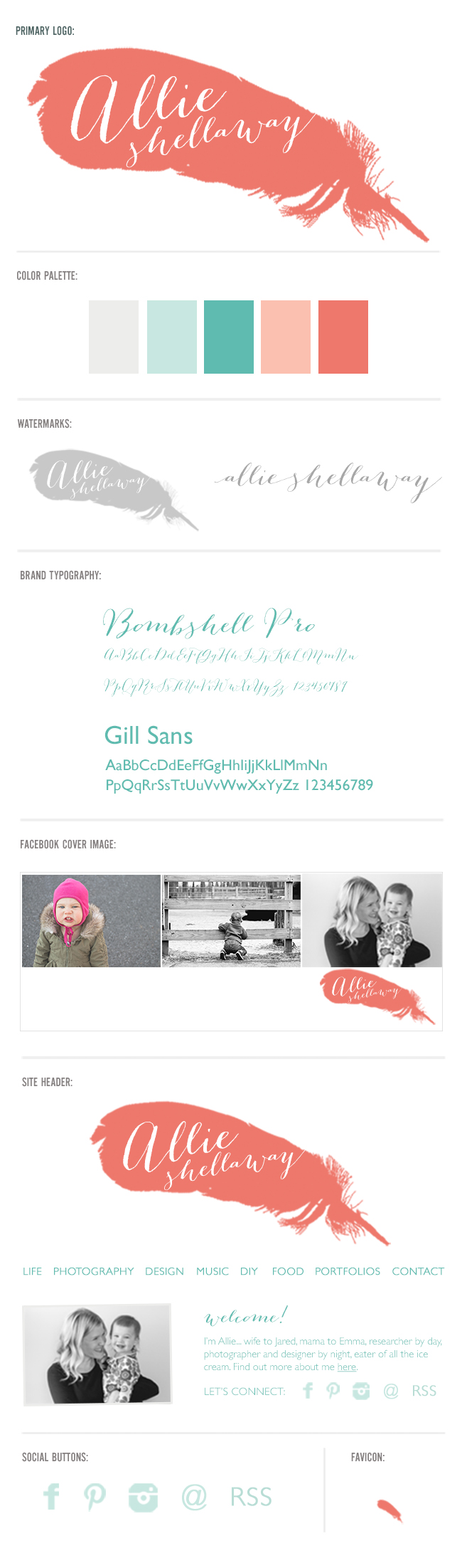
You may remember me mentioning that one of my goals for 2013 was to rebrand Made by Bird. Well, as you can see, I can cross that goal off my list! And I'm so thrilled with the result. It feels like me, but grown up. (Which, considering I'm 31, a wife, and a mom, I guess I kind of am.) The feather is a nod to my lifelong nickname, Bird, and the font is just the right combination of pretty and whimsical. (Check out more of the design elements below.) I really struggled with whether or not to keep the name "Made by Bird"... it's been my blog name for nearly 4 years! But with all my photography and design stuff being associated with my actual name, and my keen opposition to having two separate websites, I felt it was time to switch everything over to simply "Allie Shellaway." But don't worry, I'll still be posting about all the same stuff. The mood and tone of the blog won't change. (Note that I will be changing to URL over to madebybird.com next week... it's a whole other ball of wax and I just haven't had time to tackle it yet.)

So, I really hope you guys like the redesign. I have a few more tweaks I need to make to the blog - like a proper footer with a search bar. I upgraded to Thesis 2.0 (from 1.8) for the redesign and I'm still figuring out my way around. Fun fact, everything I know about web design I've learned on the fly. It's a little chaotic but it gets the job done.

Thanks for your continued support over the years (I think this is my 3rd or so redesign of the site, but certainly the biggest change so far.) There'd be no point to any of this without you. Seriously.

Branding-Sheet_allieshellaway


a better place to play

I never in a million years thought I would be a play space in the living room kind of parent, but here we are... and you know what? It works for us. Well it was working for us. After a few months with this setup, it became clear that our little galley play space needed to be re-thought. And last weekend I finally got around to it...

Before the redesign we had everything lined up against the wall, and Emma would inevitably get bored and start digging all of her toys out of the bottom of those mesh bins. It made for very unfocused and messy play. We also had a lot of toys from when she was younger that we needed to weed out.

Now Emma's toys are all within view, and mostly organized by type of activity. I know what you're thinking - there's no way it still looks like this. Well, I'm happy to report that it does! It's surprisingly much easier to clean up than before. Maybe because everything has its own place and the shelves aren't overflowing with toys.

What I love most about our shared living/play space is that you can't really see it when you first walk into the living room. And I finally found a place to display my beloved Penguin Classics collection of books...

I still have a couple of To Dos for the space, including some art in between the windows and a little upholstered chair to replace this pillow in Emma's reading nook:

What are your thoughts on having a play space in the living room? Major faux pas or an inevitable fact of life with kids?

(PS... try to ignore all the beige-overload. Oh how I can't wait to be a homeowner again.) :)

Resources: